As with any display technology, design innovation must coincide with technical innovation. Digital signage systems must work as design, not just as technology. High impact content requires that designers understand both the user experience of the particular display technology but also how to optimize each technology for their clients.
“Brands like their product to be the hero,” says Traylor Woodall, Executive Creative Director at Nashville-based Fivestone Studios. When he and his team set out to create their award-winning design for the Clear Concepts Awards competition, their first exercise was a mental shift. Transparent displays are effectively three-dimensional. From a story- telling perspective, the team started think- ing about how to use the transparent surface to provide context for real life elements and encourage movement and interaction on a fairly grand scale with a multi-screen trans- parent wall. “At one point we even considered an interactive glass elevator, where you could see information about the hotel as you looked out over the property,” he recalls.
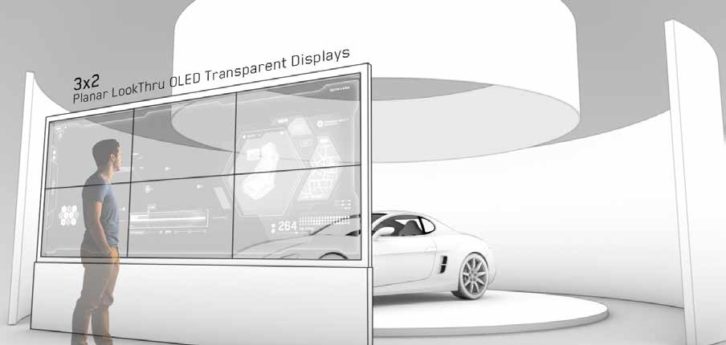
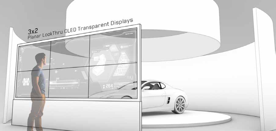
Since the contest rules stipulated that the design be technically feasible and “we had no experience with elevators,” the Fivestone team chose to build their transparent design around a luxury car in a futuristic showroom environment. They envisioned an interactive videowall comprised of six 55” Planar LookThru trans- parent OLED displays to take advantage of the product’s ability to be tiled. They pictured people being able to walk up to the car from different angles—something that the nearly 360-degree viewing angle of the Planar displays is well suited to (the screen can be viewed from the back as well as the front; content is simply reversed). And they tapped into one of the crucial advantages of transparent OLED: it doesn’t need an enclosure because it is self-emissive. This greatly opens up the possibilities for what can be behind the transparent screen—both in terms of size and content. The content doesn’t have to be sandwiched between a transparent screen and an enclosure, and the screen can be independently sized from whatever is behind it.

In the Fivestone design, users could explore information about the car through what they could see on the glass–juxtaposed to what they could see through the glass, but they could also go around the glass as well to interact directly with the car. “We envisioned the screen as a ‘con- textual halo’ where users could see features, benefits, and specs,” Woodall explains, while still maintaining the car as the star of the experience.
This was a different mindset from other designs Fivestone has created. For example, in their projection mapping projects (including Caesar’s for CinemaCon) real life objects disappear into the projection; with a transparent screen, real life objects and imagery each maintain their identity as they play together.
Once the team decided on the story, they next had to consider the palette. It was a learning curve, Woodall said to understand the way colors and blacks would appear on the transparent surface. “Essentially black is transparent,” Woodall remarks. He and creative director Chris Haberkern decided to go with light colors, “and some beautiful greys and luminescence” for the interactive contextual data, and then flip the visual experience with a very dark background and a light show that effectively caused the screen to disappear and bathed the car in pulsing colored light.
“We would talk about how it’s like a luma key in broadcast—where if there is no black behind the image and it’s shaded, it will look like a bad key,” Woodall recalls. He says it’s really important to understand the way black operates in this environment—both on the screen itself, and behind the screen, because so much of the content will be driven by the interplay and orchestration of color and light, transparency and black.
“People are still trying to figure out where we can go with this technology and it has tremendous potential for creating differentiation,” Woodall said. “Brands that want to be aggressive will figure it out, just like they did with projection mapping.”
The transparent surface also provides new possibilities for interior designers and architects. “It means you
can activate a glass wall,” Woodall says, so it can become a surface for information or aesthetic overlay.
Fivestone Studios is already comfortable doing motion design for non-traditional, often very large surfaces. The studio is growing; Woodall sees systems integrators as partners for further growth in the area of environmental content design and is currently actively meeting with integrators, and consultants.
Jennifer Davis, Chief Marketing Officer and Vice President, Marketing and Product Strategy at Planar, says the purpose of the Clear Concepts Awards was to stimulate innovative uses of this breakthrough technology and encourage inspiring, new applications for see-through installations. Planar’s experience with transparent display technology goes back to the late ’90s and encompassed pioneering work with early transparent technologies including electroluminescent displays (ELDs) and later LCD. (Planar’s history with OLED also goes way back as well.) The convergence of transparency and OLED is a breakthrough moment that comes after a long history of small victories with significant tradeoffs throughout the industry. ELDs, while groundbreaking at the time, couldn’t do full color, or really much color at all. LCD dramatically improved the color range, but required a blindingly bright backlight and an enclosure, because they are not self-emissive and the transmission is so low (and as a result the saturation and contrast). In the case of transparent LCD, Planar optimized the for- mat through engineering around three core components: LCD selection; a lighting system optimized for luminas efficiency, thermal management and color temperature; and a proprietary bonded front glass and smooth touch surface process that improves contrast by eliminating mismatched reflective layers and diffuses reflections with optical coatings. These transparent LCDs, and those by other manufacturers, remain in use. But LCD had plateaued somewhat short of the sci-fi ideal of transparent displays.
Enter transparent OLED, which opened the door for large, self-emissive displays with no enclosure, with full color saturation and contrast (greater than 100% of the NTSC spec, Planar claims). As the company had done in the past, it used applied engineering to productize the technology, including a version of the glass and surface innovations they originally developed for LCD. “Planar’s differentiation includes our proprietary ERO (Extended Ruggedness and Optics) using Corning Gorilla Glass, integrated touch, and a mechanical design which provides installation flexibility and the ability to tile to create clear video walls,” Davis says. “This product is what we and our customers wanted from the start: self-emissive, full color, and large size.”
Now it’s the designers’ turn.

DESIGN CONSIDERATIONS
BLACK IS CLEAR
Transparency is achieved with black content, while brightly colored, fully saturated content appears opaque. Unlike liquid crystal displays where black is achieved by turning on all the crystals so that they fully obscure the backlight, organic light emitting diode displays achieve black by turning all the OLED pixels off. On a traditional OLED screen that looks black, but on a transparent screen black is clear. Make sure you’re using true black and not a dark gray if you want full transparency.
BRIGHTNESS IS A AN ILLUSION
OLED transparent displays don’t emit as much light as a traditional LCD with a backlight. But the transparency of the black colors on the screen emphasize the luminosity of the other colors making them appear much brighter to the eye. When you want to make something appear bright, use a broad color gamut. Just as white text on a black background seems brighter than the same text in red or blue, using high-contrast colors against the transparent background will create the illusion of brightness.
COLOR IS POWER
Since each OLED pixel emits its own light, the more pixels that are lit, the more power the display takes. If you think about each pixel as a light bulb that can be independently turned on or off, you’ll get an idea of how content is related to power consumption. If every pixel on the screen is lit up all the time the display will use much more power than if only a quarter of the pixels are lit up. By the same token, the longevity of the display is dependent on how long the pixels are active. So, based on the content used, the power use and life of the dis- play can vary widely. Try to average having the screen transparent 75% of the time.
TRANSPARENCY IS VARIABLE
What’s behind the display is as important as what’s on the display – otherwise it wouldn’t need to be transparent. But you can use different lighting effects to change the relative transparency of the display independently of the content being shown. Think about looking out the window on a dark night. If you have the lights on inside, you’ll just see your reflection in the glass, but if you turn off the lights inside you can see outside clearly. By adjusting the lighting both in front of the transparent display and behind it, you can emphasize different objects or obscure them until you’re ready for them to be seen. All content is an exercise in moving people’s attention; a transparent display simply gives more places for that attention to be focused.