Figure 1: The limitation of a single time window on the FFT analyzer. Frequency resolution is linear no matter what the time record length is or how it is displayed. See larger image.
In part one, we explored how the modern FFT analyzer creates a composite high-resolution log frequency response out of a series of linear captures. Now we will build on that foundation by adding a second analyzer channel, which allows us to make the comparison measurements known as “transfer function” analysis.
Before we dive back inside the analyzer, let’s think about the desired function of the transfer function: an aid to sound system optimization. We would like it to help in five main categories: speaker positioning (aiming, spacing, splay angle, etc.), acoustical modifications, equalization, delay, and level setting. All of these, except delay setting, require high-resolution frequency response data. Positioning, acoustical issues and delay require time data. We need to be able to identify the direct sound, reflected sound, and noise unrelated to our signal.
Transfer Function Amplitude
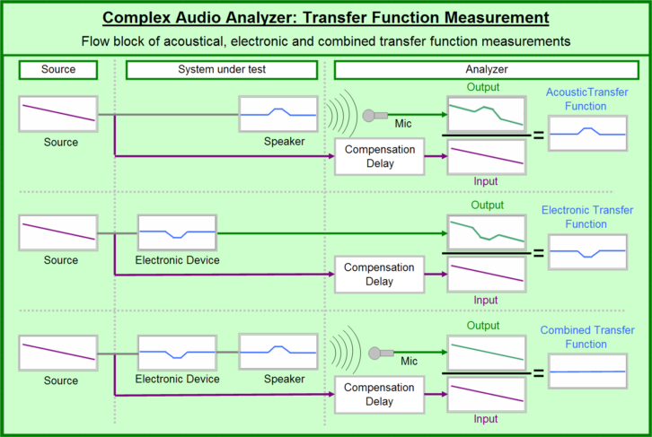
We use the term “transfer function” to describe the behavior of linear devices in our signal path. They can be passive like a wire or active, such as an equalizer. It is a scientific sounding term that boils down to the overall effects on frequency and phase between the input and output of the device; the difference between the gozinta and the gozoutta.
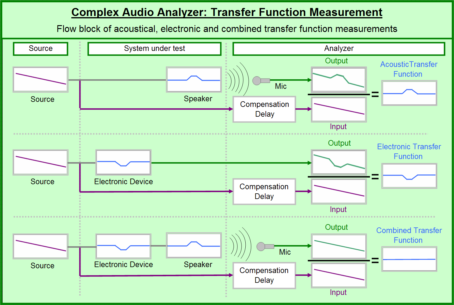
The math of the transfer function is complicated under the hood but extremely simple to understand from the outside. For level analysis, it can be modeled as division: output over input. For temporal analysis (time and phase), it can be modeled as subtraction: output minus input.
Let’s start simple. If the output is 2V when the input is 1V we get a transfer function amplitude ratio of 2:1 (a.k.a. +6dB). If the same device had an output arrival of 2 milliseconds after an input arrival of 1 milliseconds, then we have a transfer time of 2-1=1 milliseconds. If the device is linear (i.e., it maintains a constant transfer level and transfer time), then we can predict its output behavior relative to its input. If we now put 4V at 10 milliseconds into it, we will see 8V arrive at the 11 milliseconds mark.
Now let’s take the 48 point/per/octave data we studied in part one and put it to work. One FFT channel captures the output and the other the input. Now we have the transfer amplitude and transfer time (phase) at every frequency.
The beauty of transfer function analysis is portability. We can pick any starting point and stopping point in the signal path and see the difference in level and time. It can span from the input of the console all the way to the sound at the last row, a single device or as even just a single resistor inside a circuit. Physically, this amounts to two probe points (in and out) that are each “Y’d” into the analyzer, allowing the signal to flow through the system as normal while it feeds us data in parallel.
Let’s put the concept of linear relationship to bed with some examples. One kHz alone goes in, 1kHz alone goes out: linear. One kHz goes in, 1kHz and 2kHz show up at the output: non-linear (harmonic distortion). Pink noise in and pink noise out: linear. Punk noise in and (the same) punk noise out: linear. Good jazz at the input and Kenny G at the output: non-linear. We can get the transfer function of a device using a random source because to us, it is not random (since we have a copy of what arrived at the input). In practice, even the best system we measure has some non-linear behavior. It has a noise floor and some distortion. If a system has too much noise, or too much distortion, the transfer function data will not be reliable and repeatable.
The advantage to source independence, (i.e., being able to use random signals such as music), is extremely obvious, especially when the lights go down. There is a catch though, if we use a random source and the input and output are offset in time (such as music through a DSP, or sound traveling through the air). Our analyzer needs a little help to get an accurate frequency and phase response. We must synchronize the two channels inside the analyzer before we crunch the numbers, without affecting the actual signal flow.
The Modern Analyzer, Part 2
May 30, 2014 2:19 PM, By Bob McCarthy
Understanding the transfer function analysis.

Figure 2: The multi-time windowed FFT. Resolution and display stay constant over the full range of frequencies. See larger image.
A few variable sequences will illustrate this. Let’s put “aaaaaaaa” in. We get “aaaaaaaa” out. Our analysis reveals that the device amplifies the signal to bold face type—easy. It would not matter if we sampled only one “a” or all eight. And it would not matter if we compared the first four letters of the output to the middle four of the input. If we have an endlessly repeating sequence we can fall out of sync and not care.
Now the input sequence is “abcdefgh” and so we get “abcdefgh” at the output. Once again is does not matter if we sample one letter or all letters, as long as we are in sync and therefore compare the same letter. If we are not in sync then “cdef” at the input could yield “abcd” at the output. Now our analyzer is confused about the bold-faced liar it is measuring. So it is with music, at least the kind that is not an endless repeating sequence.
Transfer Function Phase
The technique for reading phase response is literally best described as “connect the dots.” A frequency response is a series of amplitude and phase values. If we solo up one frequency, we get an amplitude value that needs no further explanation. Unity is unity. A gain of +6dB is exactly what you think it is. But that single-phase value gives us nothing to make a conclusion with. We need to get a second frequency and then connect the two phase values together. Now we have a phase slope, which can be decoded into time by discerning the rate of phase shift over frequency. For example, if we have 360 degrees of phase shift over a span of 1kHz, we have fallen 1 millisecond behind (or ahead).
Let’s break it down. First we find the slope direction, read left to right on the frequency axis. A downward slope is delay (output after the input). This is normal and intuitive. An upward slope indicates anti-delay (output before the input). This is also normal and extremely unintuitive. There are two places you are likely to encounter this: anytime we have an internal delay in our analyzer and with filters in our measured circuit. The first is easy. We use an internal delay to line up output and input. If we put in too much delay, we see the phase slope rising. In rooms we see this anytime the temperature rises, since the speed of sound accelerates and gets to our mics quicker. Wrapping our heads around anti-delay in the filter scenario requires a Ph.D. in filter theory and even then it’s controversial. Suffice to say that our rendering of the phase in filters is a simplification of a more complex reality. Nonetheless, if you view the phase response of a filter you will see both a rising slope and falling slope.
The next level is analyzing the slope rate of change. That is the timing information. It is linear, so we clock the rate in Hz, not in octaves. We don’t have to take the entire 2kHz bandwidth into account at once. We can and should break the spectrum down into digestible pieces. Choose a range of frequencies and start there. So if we saw a 90-degree shift between 250Hz and 500Hz we would know we have 1 millisecond of delay. How? 90 degrees is 1/4th of a cycle (360 degrees). If we move 90 degrees in 250Hz, we can extrapolate that to be a rate of 360 degrees per 1000Hz (i.e., 1 millisecond). The same would be true no matter what frequencies start and stop the slope. If we have a 90-degree change in a 250Hz span, we have 1 millisecond. A steeper slope (more phase shift over the same frequency span) indicates more time. A constant rate of phase shift indicates a constant delay over frequency. A variable rate of change indicates a device with frequency dependent delay. Because time is linear and our frequency axis display is log there is a visual trick to remember. A constant delay over frequency will appear as a steepening phase slope, although it is the same linear frequency spacing (and same time).
The Impulse Response
We just saw how the phase response put the frequency domain information in plain sight, but required us to go through a decoding process to convert the data to the time domain. The impulse response reverses this paradigm, giving us a straightforward view of the time domain along with encrypted frequency response information. The impulse response is a wonder of simplicity to put to practical use. It tells us the arrival times of the direct sound and reflections in the units we can most easily understand: milliseconds. While it is immediately apparent how to read the impulse response, it is not at all so to understand how the analyzer derives the response.
The first thing to understand is that the impulse response is a mathematical construction of a hypothetical experiment that we don’t have to actually perform. The display we see is the answer to this question: What would we see on an oscilloscope (amplitude vs. time) if we put a single perfect impulse into the system? Pop goes the pulse into our system and we wait for its arrival at a mic, then stick around to see as it arrives again, and again after reflecting off the floor and other surfaces. That’s the easy part, but now the questions begin: What is a perfect impulse? How can we see the impulse response when we are putting continuous noise or music through the system?

Figure 3: Comparison of analyzer platform features and capabilities. See larger image.
Mathematicians don’t throw words like “perfect” around lightly. If you guessed that this is another one of those infinity constructions, you win a prize. A perfect impulse is an audio stimulus signal created by the following recipe: all frequencies, equal level, in phase for the duration of a single cycle each. It is like a one lap race for all frequencies with everyone ready to run once the starter pistol fires. In fact a version of a starter pistol is used as an impulse generator by acousticians for room analysis. The perfect impulse with its infinite frequency range is an infinitely thin single transient spike that rises and returns to normal. In the practical world we need the impulse to have the same frequency range as we are measuring (e.g., up to 20kHz) so the pulse width becomes finite and visible. A system with a perfectly flat amplitude and phase response over frequency will return an impulse that rises and returns in the minimum time with no additional features such as overshoots, undershoots, or ringing. That is the only way we can ever see a perfect impulse response. If there are any peaks or dips in the amplitude and/or differences in phase slope, the impulse will show overshoots, undershoots, or ringing.
If there is a time offset between the output and input (recall that this is a transfer function measurement) then the impulse will shift its position on the x-axis to the left (output precedes the input) or the right (output is after the input). Of course the output cannot precede the input in physical reality, but our analyzer is just responding to two signals, which can come from anywhere and we also have internal delay in our analyzer so this is not an exotic occurrence.
Let’s study the impulse response and see what it reveals. The standard features are a dead zone before the arrival, the shape of the impulse and any secondary arrivals that follow. The dead zone is the transfer time, i.e., latency; for example, the time it takes to get through a digital device or travel through the air. The analyzer finds this by recognizing the content of the input and output signals as similar but offset in time. The next thing we notice is the orientation of the impulse, which reveals the polarity of the system (positive or negative). The third feature is the rise and fall of the pulse. A steep vertical line with no ringing indicates a flat amplitude and phase response. A rounded impulse indicates the system has high frequency loss and/or frequency dependent phase shift. Ringing (before or after) is the hallmark of filtration (electronic or acoustic filters). Beyond the first arrival we will see extra copies of the input signal arriving later. These are recognized as the children of the input and are shown as secondary transient peaks lining up behind the first arrival. Reflections are identified this way.
How does our analyzer give us a display of transient peaks that look like snare drum hits when we put in the music of 101 strings? This is where the math magic comes in. Recall that the original FFT transform took our time domain signal and converted it to the frequency domain. Then we took two channels to create a transfer function phase and amplitude over frequency. The impulse response we see is the result of a second generation of FFT calculations, in effect, an FFT of the amplitude and phase over frequency, that converts us back to the time domain. This is termed the Inverse Fourier Transform (IFT). The product of the IFT process is a simulation of the waveform that would result from a perfect impulse passing through the system that had the measured amplitude and phase. Because the transfer function amplitude and phase are source independent, we are able to build our impulse simulation by listening to pop music (not the sound of a single pop).
Coherence Over Frequency
Coherence is the answer to the question: “Hey analyzer, do you have any idea what you’re talking about?” Coherence values range from 1 (yes, I mean it) to 0 (I am just making it up), with educated guess in the middle. The real math is beyond the scope, but we can comprehend the principals pretty easily. Coherence is statistically derived; it requires multiple samples, which we average together. What we are looking for is agreement between the samples. If they are all providing the same transfer function values then we have confidence in the averaged value. If the answers are all over the map then we lose confidence. Why would there be disagreement? Noise. Any transfer measurement contains a noise component, i.e., uncorrelated signal at the output that was not present at the input. The question is simply, how much noise compared to the signal we are sending through the device. The answer is “coherence.” In the case of a line level device, the signal to noise ratio should be very high. Once we get into the acoustic world everything moves in noise’s favor. We have HVAC, forklifts, reflections, and much more.
Coherence is evaluated on a frequency-by-frequency basis, so we can see which ranges are faring better than others. We use coherence to make decisions, and most important, to not make decisions. Very high coherence tells us we can make adjustments with confidence that the changes will have a predictable effect. Low coherence means that there is more going on here than meets the ear, and we could find ourselves turning knobs on the equalizer and seeing little or no improvement. Adjustments such as adding absorption, adjusting splay angle, and setting delays can produce great improvements in coherence. Many audio engineers will differ on whether a particular equalizer setting is an improvement. Coherence, on the other hand, correlates highly with quality of experience. If we make an adjustment that improves coherence there is usually widespread agreement.

Figure 4: An introduction to coherence as applied to sound system optimization. See larger image.
Putting the Transfer Function Analyzer to Work
Transfer function amplitude answers the question of gain or loss both as a whole and over frequency. Phase answers the question of what frequency arrived when. The impulse response can precisely identify direct sound and reflection timings. Coherence tells us whether our data is contaminated by noise.
The impulse response is the tool for setting delays, and tells us what surfaces are causing the most trouble. Hopefully we will be allowed to treat them. The phase response is the key for joining speakers together at crossover—subs to mains, mid-drivers to HF drivers, and more. Phase response also reveals the compatibility between different speaker models. Maybe they meet at the highs but what about the mids? There are specialized phase filters that can help with this.
Transfer function amplitude helps us find the best aim, splay angles, and spacings. We measure the level on axis and then compare it to the level at the other key locations. For a single speaker we compare the on-axis response to the outer edges of coverage and move the speaker until minimum differences are found. For splay angle, we compare the individual on axis levels with that at the intersection between the speakers. The angle can be adjusted to minimize the difference. Spacing is done much the same way. Move the speakers apart until the level at the mid-point matches the level on axis to the individuals.
Equalization uses the coherence function to select which frequencies are good candidates for equalization and which are better off trying other solutions. Transfer function amplitude then shows us the peaks and dips that need treatment and how well they have been equalized.
Hopefully this two-part article will help you to get the best out of your FFT analyzer. Much more information on this topic can be found in my book Sound Systems: Design and Optimization on Focal Press.
