New interactive coronavirus map released by JHU
Below is how the map looked in the first week of May. It was created in January but caught on in the media in the beginning of May.
Researchers at Johns Hopkins University have released an interactive coronavirus map and dashboard that lets us track and visualize the Wuhan coronavirus outbreak on a daily basis. The data is overlaid on an interactive map of the world showing reported cases of infection highlighted in red, and the locations of fatalities denoted by an ‘x’.The interactive coronavirus tracking map and dashboard was created by Johns Hopkins University’s Center for Systems Science and Engineering, with the goal of informing the public about the spread of the virus now known as 2019-nCoV.
InfoComm 2020 cancellation FAQ
Where in the US? (interactive coronavirus map)
As of May 3 10a ET
Small Business Association details loan and capital assistance options
What is considered critical infrastructure?
List of Statewide Delayed Projects Reports (PDF)
California
New York
New York City
Texas
Pennsylvania
MORE
Interactive coronavirus charts predict arc and peak timing by state
The Institute for Health Metrics and Evaluation (IHME) is an independent population health research center at UW Medicine, part of the University of Washington, that provides rigorous and comparable measurement of the world’s most important health problems and evaluates the strategies used to address them. IHME makes this information freely available so that policymakers have the evidence they need to make informed decisions about how to allocate resources to best improve population health.
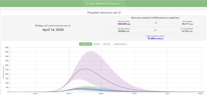
Their charts model the arc and peak for cases and hospital resources) demonstrating the predicted variation of timing for each state as well as the projected timing until states will see deaths level off, assuming mitigation continues.
![]() Work from home; Here’s an opportunity to learn more about using the 5GHz spectrum for wireless intercomm–and to have contact with other humans!. This is a free webinar airing live next Thursday. Speakers include: Former editor of SCN, Kirstin Nelson, industry journalist Cindy Davis, and experts from Clear-Com who will discuss the thinking behind intercom and 5GHz.
Work from home; Here’s an opportunity to learn more about using the 5GHz spectrum for wireless intercomm–and to have contact with other humans!. This is a free webinar airing live next Thursday. Speakers include: Former editor of SCN, Kirstin Nelson, industry journalist Cindy Davis, and experts from Clear-Com who will discuss the thinking behind intercom and 5GHz.
NOW ON DEMAND
Microsoft will extend support for some older versions of Windows 10 due to coronavirus
Apr 2: Democratic National convention pushes to August
Mar 30: InfoComm cancels
Mar 26: DSE reschedules for Sept. 15-18
Mar 23: Extron President Andrew Edwards issues coronavirus update: operations and support
Mar 16: L’Acoustics COVID-19 update
Mar 12: Disneyland closes
Mar 12: DSE postponed
Mar 11: NAB Show cancels for April
Mar 10: AVID pulls out of NAB and cancels Connect events on coronavirus concerns
Mar 10: 2020 New York Auto Show pulls out of Javits
Mar 9: Almo Pro AV cancels E4 Experience Santa Clara
Mar 6: SXSW canceled over coronavirus concerns
Mar 5: Apple pulls out of SXSW over coronovirus concerns
Mar 4: Prolight + Sound postpones on coronavirus concerns
Mar 2: Geneva Auto Show cancels on coronavirus concerns
Feb 28: Game Developers Conference postpones on coronavirus concerns
Feb 27: Digital Signage Expo 2020 will stage as planned
Feb 26: Nortek issue warning on possible display chain delays
Feb 19: NAB affirms 2020 NAB Show is set for April
Feb 17: Facebook cancels global marketing conference in San Francisco